Understanding the Basics of Color Theory
Primary, secondary, and tertiary colors
Ok should we start with a color lesson first? The artist in me can’t talk about color scheme without first talking about the basics. Primary, secondary, and tertiary colors. I think a lot of us learned this in art class back in elementary school. Now I’m going to keep this simple. You can definitely go down a rabbit hole of what the three primary colors really are in scientific terms. But we’re speaking from an artistic perspective which, in this case, makes the primary colors red, yellow, and blue. Secondary colors are green, orange and purple. Tertiary colors are a 1:1 combination of a primary and a secondary color mixed together. Like red-orange, purple-blue, or yellow-green and so on.
Warm vs. cool colors
When choosing a color palette for your space, you also want to consider the tones of different colors. Warm tones vs cool tones. They can, of course, bring a different ambiance to a space. Warm tones can provide a sense of comfort, while cool tones may be better for productivity. Figure out the mood you’re trying to set and go from there. In my opinion a well balanced space has a combination of both tones. So find that balance for your home.

Assess the Space
Room size and lighting
The color scheme you choose combined with the lighting of a room can be crucial for defining a space. You should also take into consideration the size of the room. A common idea is to paint a small space a light color to make it appear bigger. Or paint a large space a dark color to make it more cozy. While those are good things to keep in mind, don’t make it a hard and fast rule. For example, a powder room is usually small. Most people expect it to be small and the paint you choose isn’t going to change the square footage. So you could lean into the small nature of that room and paint it a darker color to embrace its size.
Another great thing about small spaces is the ability to have more fun when it comes to color and pattern. In a bigger space lots of color can be overwhelming and busy, but in a small space it can be an opportunity to have a little more fun without overwhelming the eye.
Purpose and function of the room
Assess the purpose of a room. Something to consider is the color scheme you want for the type of room you’re working on. For instance, if you’re someone that gets distracted by busy colors or patterns while working, then going too bold with your color palette in an office space may not be the best choice. But if you’re someone that falls asleep easily in a muted, darker toned space; then that’s probably not where you want to have a light and bright color scheme.
Consider Mood and Atmosphere
How different colors affect emotion and energy levels
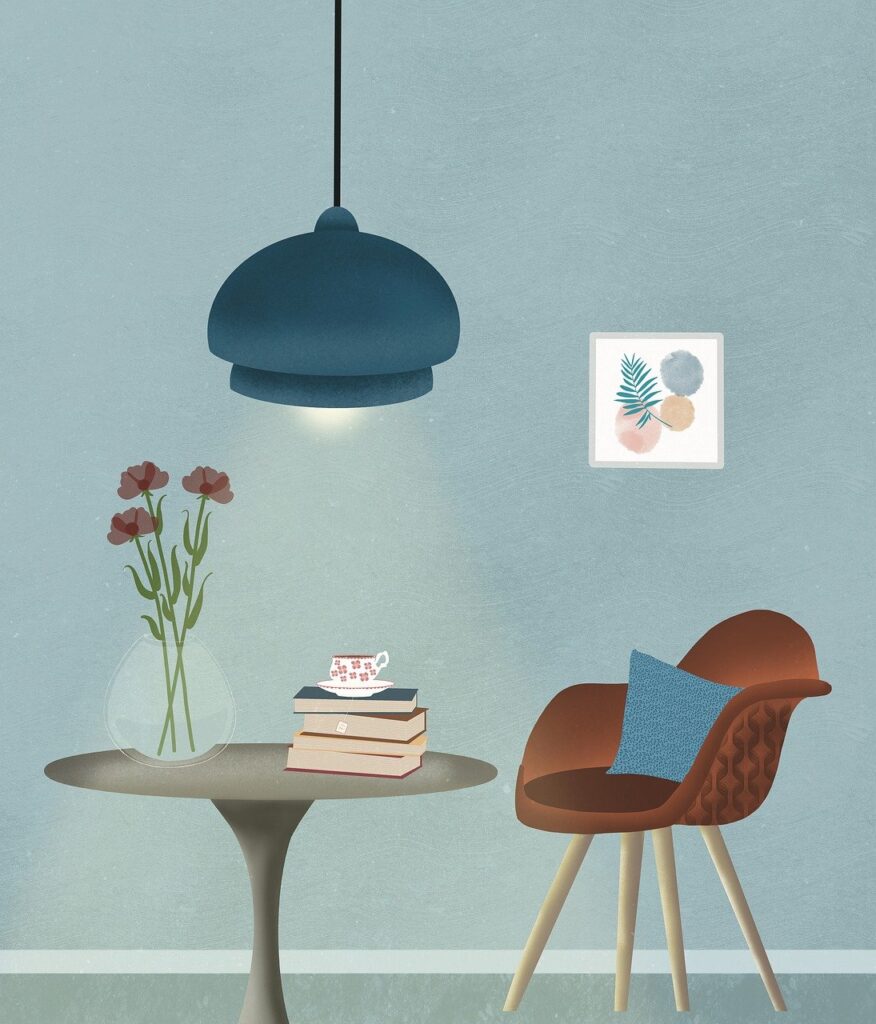
Vibrant colors can be better for a brighter happier mood and perhaps spark some inspiration. Lighter neutral colors can create more peace and calm in your space. Darker shades can give a more moody, warm, and maybe even a sexier atmosphere.
Suitable colors for different rooms
Whites, beiges, grays and other light tones can be the source of calm or a source of inspiration. Brighter colors can also be a source of inspiration or a source of fun and joy. Don’t be afraid to break the rules in regards to what’s suitable and what’s not. Design rules are made to be broken and ultimately what you find fits one mood, someone else may feel the opposite. It all depends on your personality and needs. Examine how the space could embody you personally.
Start with a Base Color
Choosing a dominant color that sets the tone
When you’re brain storming color schemes, you could consider isolating a dominant color. This may help with figuring out how to build a color story. It should act as an anchor for cohesiveness in a space. This is the color that is seen the most or accented the most. It’s the color that the other colors in the room can pull from or enhance.
How to build a palette around this base color
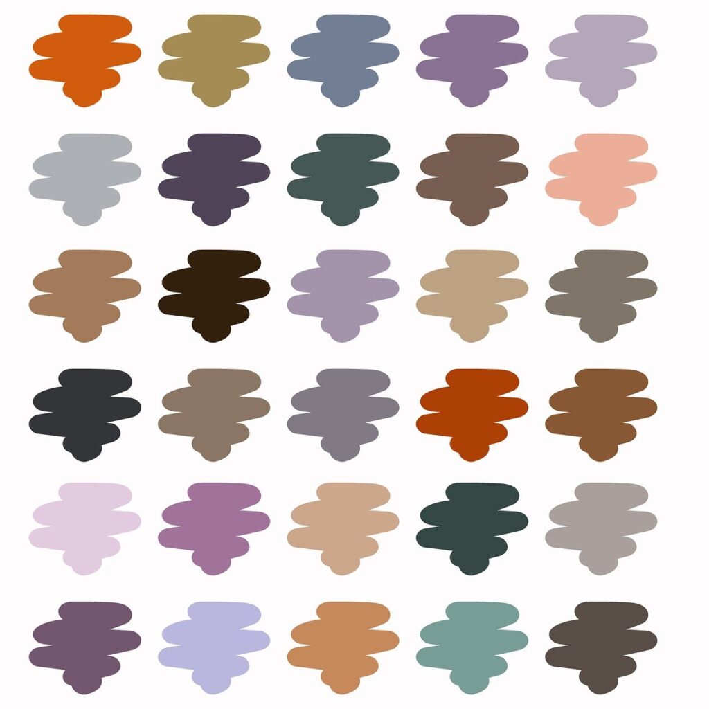
After you’ve chosen the base color, you have to build around it. For instance, if I choose a deep muted purple color, the palette i would build around that will most likely have other deep muted colors. I could do a dark forest green or a muted mustard yellow to complement the purple. Or I could create a monochromatic color story, and choose different shades and tones in the purple family. So muted purple with a more vibrant purple. Purple with cooler or warmer undertones. Different shades of purple like; dark purple, plum, lilac, or lavender. Those different variations of the same shades, brings a ton of depth to a space.
Incorporate Accent Colors
Using accent colors to add interest and contrast
When choosing an accent color, I’m usually considering either the most bold colors or complementary colors. Complementary colors sit opposite one another on the color wheel. These colors have the most contrast between them. Green-red, blue-orange, yellow-purple. They can help in avoiding matchy matchiness if that is a concern of yours.
Tips for selecting and placing accent colors
To me, less is more when it comes to accent colors. I personally don’t want to overwhelm a space with an accent color. It is an accent color after all. I think taking that approach will help you to avoid having a space that is trite or tacky. You should do just enough to create aesthetic intrigue.
Balance and Proportion
The 60-30-10 rule for color distribution
The 60-30-10 rule is a design structure that helps with distribution of color in a space. It’s meant to create proportional cohesion. The idea is 60% of the room should be a dominant color, 30% should be a secondary color. And 10% should be an accent. Of course you can play around with this however you’d like or not use it at all.
Ensuring harmony and balance in the color scheme
Truthfully, if you find the perfect balance between shades, you can put almost any colors together. The key word is BALANCE.
Test Before Committing
Using samples and swatches
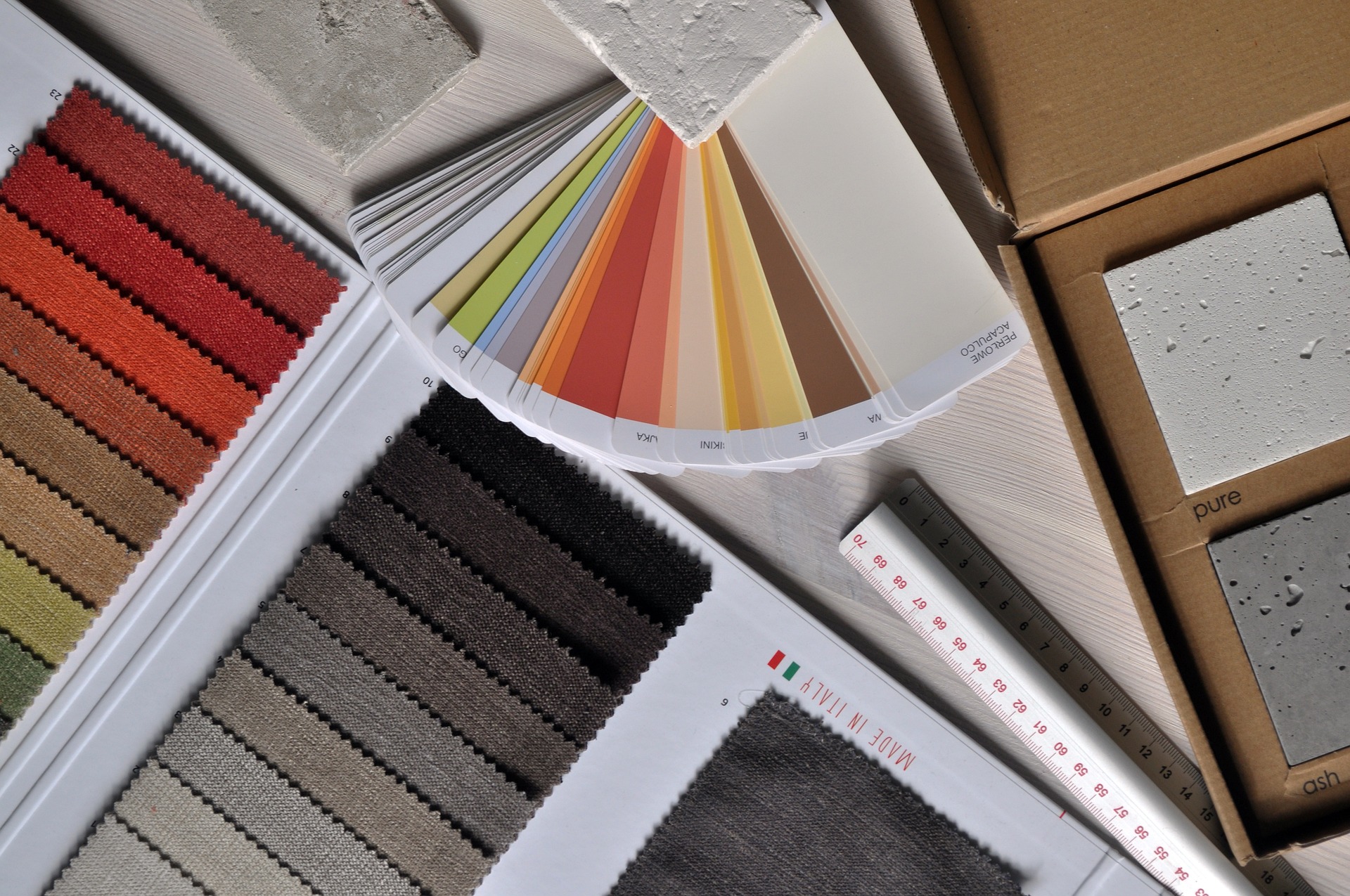
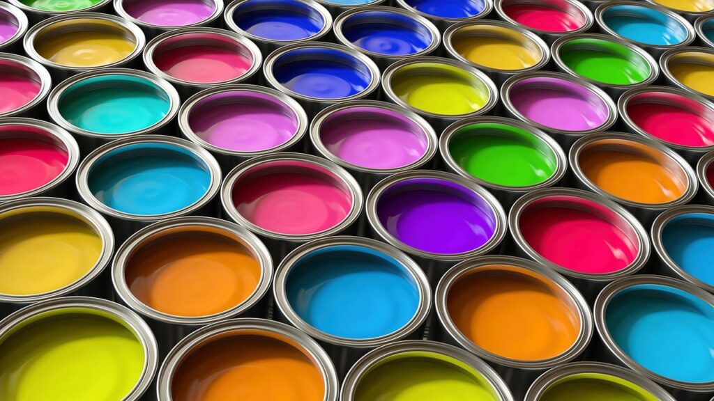
You can get a quart of a paint sample from Sherman-Williams for under $12 to test and try. You can get free paint swatch chips from stores like Walmart, Lowe’s, or Sherman-Willams.
As far as fabric is concerned, many stores offer free fabric swatches in person or to order online. Stores like Sixpenny, Crate and Barrel, or Discounted Designer Fabrics will ship free swatches to you.
Painting small sections of a wall will assist in visualizing your idea. Using temporary decor to see how colors look in different lighting can also help with visualization. You can also lay your swatches out and group them together to assess their compatibility.
Consider Trends vs. Timelessness
Pros and cons of following current color trends
Following trends can bring new life to an older home but those trends eventually become outdated. Is that color choice you made based on the latest TikTok trend boring you now? That’s something to consider when weighing the pros and cons.
Timelessness is just what it sounds like. It doesn’t go out of style. They’re colors that always make sense no matter the time period.
Choosing colors that stand the test of time
In my opinion, colors that will always maintain relevance are colors found in nature. Earth tones like olive or forest green, browns, shades of red or blue. I’d lean into those options for a timeless technique.
Practical Tips and Tools
Online tools and apps for color selection
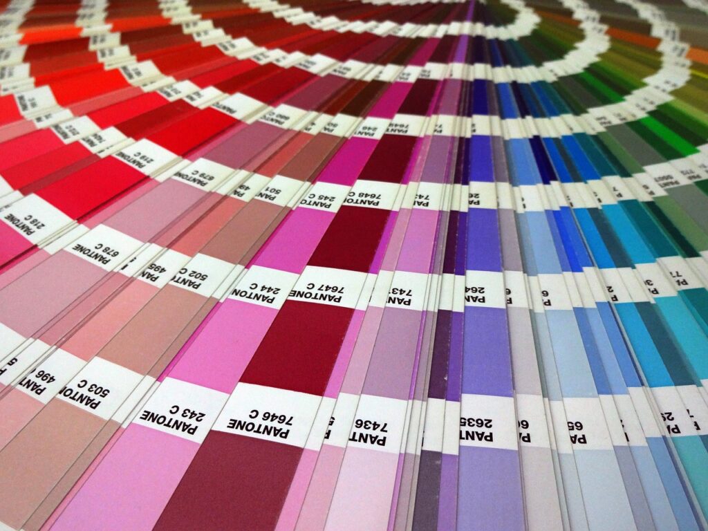
Check out these online tools to help with the heavy lifting: Coolers, Canva, Colormind, or Paletton can assist in color scheme selection and comparison
Tips for coordinating colors across different elements (walls, furniture, decor)
A stylish way to use color is to match curtains to wall color. Doing so can create a monochromatic look that sets a specific mood. I’d do this by using different shades of the same color for the wall, baseboards, and curtains.
Another idea is to use books to provide an accent color or complementary color.
My last tip is to take a look at your favorite rug. If it has multiple colors in it, isolate the least used of the bunch and use it as an accent shade. Because it is the least used color, it can provide some subtlety that helps a space to not look tacky.
Personal Touch
How to reflect your personality in the color scheme
We’ve talked about this before but your place should capture your essence. What colors speak to you the most? What colors are you drawn to? . Perhaps you can look at your closet. If there are colors you tend to gravitate towards to wear, maybe those colors would look good in your space as well. Play with those tones and patterns.

