Sad Beige Aesthetic
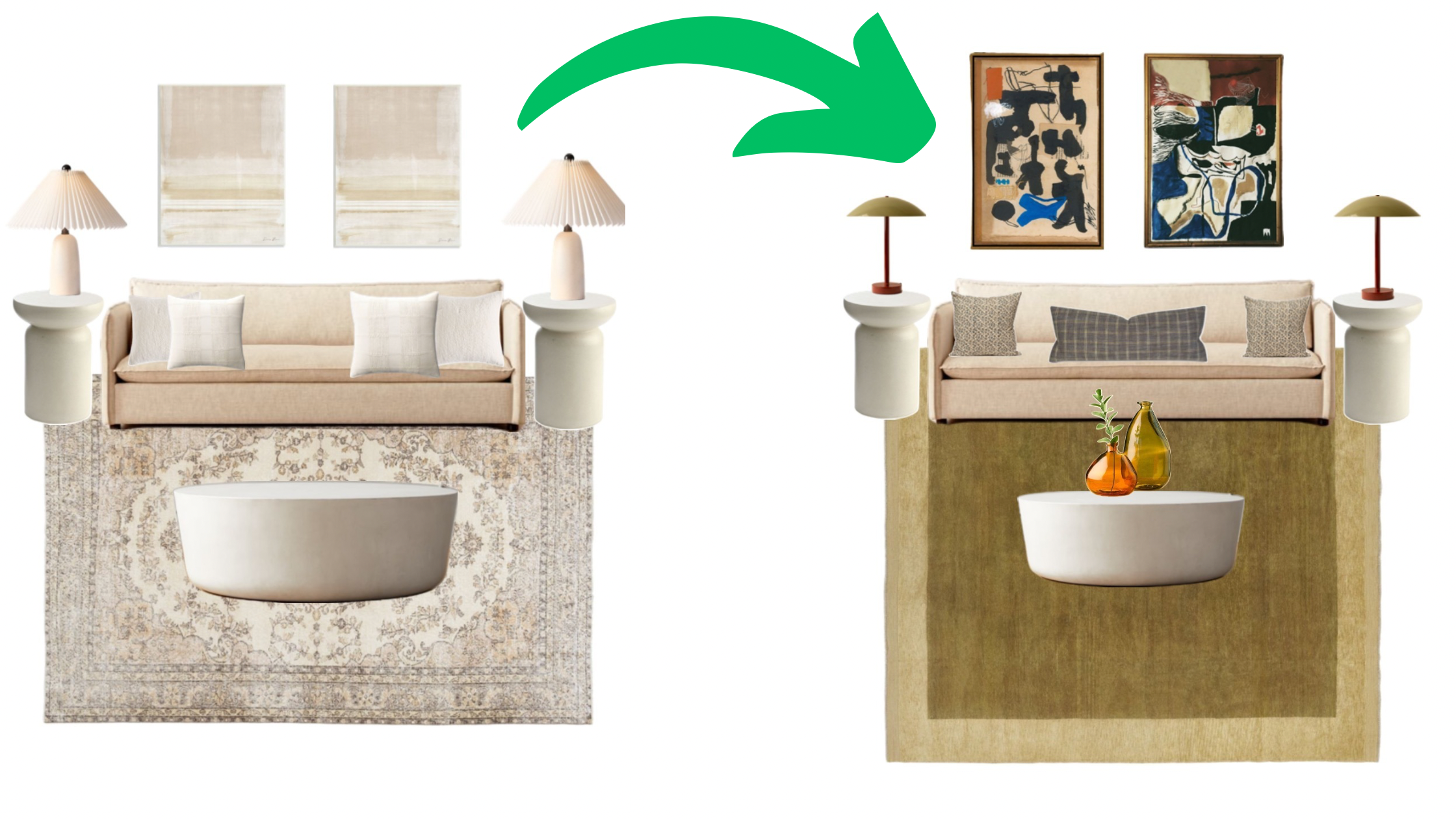
I’m sure you’ve seen a lot of light, white, or beige homes lately. Influencers seem to love fifty shades of beige more than anyone. And the term “sad beige aesthetic” has been popularized as to poke fun at these spaces and the people that adore them. I’ve been looking into a lot of potential effects of all white and/or beige spaces. Depending on what source is more verifiable to you, a crisp clean space can either stimulate creativity or cause anxiety and depressive moods. In my opinion, these color lacking spaces are uninspiring, sterile, and a pain in the butt to keep clean. Introducing just a little color, texture, and patterns can create a more dynamic and inviting environment. It’ll create more warmth and tons more personality!
Understanding the Basics
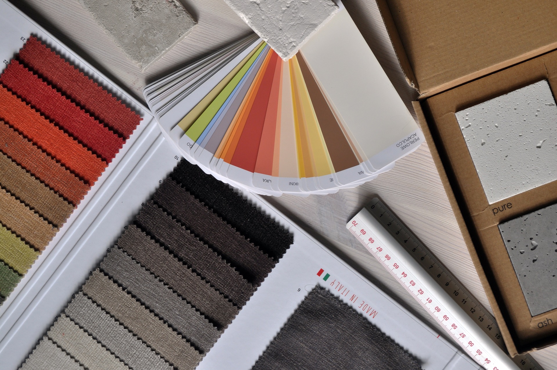
Color Theory: In my last post we talked about the basics of color theory, so I won’t bore you with that again. Check it out here if you want to learn more. But I will say that using color, in whatever saturation you’d like, will breathe more life into a space. Take advantage of complementary colors and tertiary colors for a more layered look.
Pattern Fundamentals: Adding more patterns will add much needed visual interest to an all beige interior. Patterns like floral, paisley, or polka dots, tend to lean more feminine. While plaid, windowpane, or stripes tend to lean more masculine. Of course there’s nuance there, but the point is to recognize the vibe you’re trying to achieve. And understanding that a combination of different patterns can add character and balance to a room.
Assessing Your Space
Evaluate Lighting: Take a look at your lighting. most designers suggest warm lighting for the home, but I think you can play with this a little. Warmest lighting in the bedroom and living room. Daylight lighting in the kitchen and bathroom with the addition of warmer countertop lamps. Also, I know that there’s mixed opinions about colored lighting, but I think color changing light can be fun for mood setting. You can of course, keep the lighting on a warm setting for the majority of time. But for movie nights or a party, color changing lights can be a ton of fun.
Room Functionality: Once you’ve decided on a purpose for a room, the next step is to consider how the purpose might influence your color and pattern choices. Perhaps in your bedroom you prefer a brighter space that helps you wake up in the morning and start the day early. If that’s the case, a light pastel color palette may make more sense for you. But if you prefer a darker, more academia style that helps you fall asleep at night, then a more muted or deeper color palette might be a better fit. Both options introduce more color to the room, but in your preferred saturation. Color doesn’t have to mean bright and bold if that isn’t your taste.
Choosing Colors
Accent Colors: In my last post we talked all about accent colors and color combinations. Even color psychology and how colors can affect your mood. Read that here if you want to know more about that. And also check out this tool to help choose a harmonious color palette. The great thing about starting from a neutral palette is that you basically have a blank canvas. So please EXPLORE!!!
Introducing Patterns
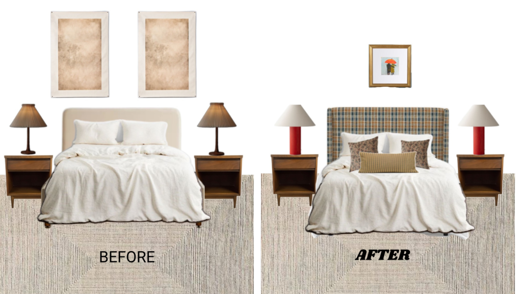
Pattern Placement: Some of my favorite ways to introduce patterns are rugs, throw pillows, bedding, curtains, wallpaper. This is especially good if you’re not looking to replace large furniture pieces like a bed, couch, or tables. But if you do have the budget for it a patterned bed or couch can be really unique. You can keep it toned down by having neutral bedding or rug if you don’t want to be too extra.
Mixing Patterns: I really enjoy combining feminine and masculine patterns. The juxtaposition between a plaid pattern and a tight floral pattern is just so beautiful to me. I feel like you can put almost any pattern together as long as it’s small and concise. It’s the larger scale patterns that tend to look busier even on their own. So I’d personally stay away from those. Remember the bigger the tackier. Sticking to that should ensure your space doesn’t become overwhelming.
Practical Tips and Ideas
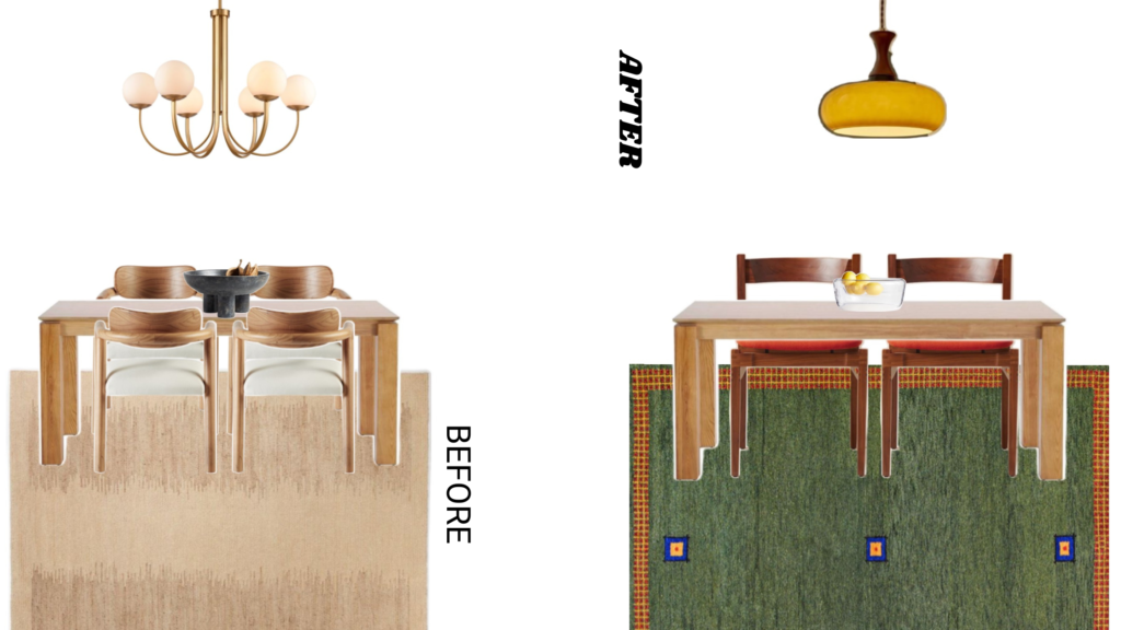
Textiles and Accessories: Like I mentioned previously, textiles are a great way to add color and pattern. Switching out pillow covers, a duvet, throw blankets, towels, or shower curtains are a simple fix. Also don’t underestimate the power of hardware. You can change out your current metal hardware for colorful ceramic ones.
Artwork and Decor: Do away with the bland beige artwork and use the space to display something with more color and character. You could get something that has a story to it, a conversation piece. I don’t think big box stores are the enemy but when it comes to art, I’d steer clear. Support a local artist, buy vintage, antique, or make it yourself if you’re artistic.
Furniture: I’m usually not a fan, personally, but colored furniture can be another way to spice up your space. Things like colored/patterned dressers , armoires, side tables, or coffee tables are a cool option if you’re into it.
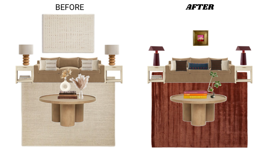
Say NO to Sad and Beige
I understand why people are gravitating to these neutral colorless spaces. Many people lack a designer’s eye and aren’t able to put a look together like a professional would. Sticking to an all white, beige, and/or cream palette, makes it easy to decorate your space. You just put those colors, or lack thereof, together and you have a cohesive space. Trust me, I get it. But while this design approach is cohesive, it lacks personality and character. We all have our own identities so what better place to display them than OUR place.
If you’re over the sad beige aesthetic and ready to try something different, start simple. You can start with something small or budget friendly and go from there. Look for inspiration on Pinterest or YouTube. Brainstorm, window shop, and pay attention to what jumps out at you that isn’t beige.
I recommend these YouTubers for inspo: Paige Wassel, Caroline Winkler, Medora Kea, Lindsay McDaniel, GarrettLeChic, and Noah Daniel.
And I recommend these tools for palette selection: Muzli Colors and Coolors
